Eight Proven Ways to Inspire Trust and Credibility With Your Healthcare Website
By Katie Lundin
If you’re in the healthcare industry, you know it’s important to cultivate trust.
Health can be a very personal matter. Healthcare providers make life-and-death decisions for their patients. And patients make themselves vulnerable (financially with their health insurance and physically with their medical team) with every interaction. The personal stakes can’t get any higher. That’s why building a foundation of competence, credibility, and trustworthiness is essential for every business in the healthcare industry.
Since your website is your primary online ambassador and a core part of your brand identity, if it fails to inspire trust, you will lose customers. Don’t just take my word for this: Seventy-five percent of people judge the credibility of a business based on its website. And people may judge healthcare businesses even more harshly because the potential stakes are so high.
Don’t lose business—or, more importantly, the chance to help patients in need—due to weak website design. Here are eight tips for making your healthcare website design more credible and trustworthy.
Keep your website patient-centric
Patients—people—are the lifeblood of the healthcare industry, so your website must be designed with your patients in mind. If patients or prospective patients can’t find what they need easily, then your website has failed in its sole purpose—and you’ve likely lost a customer.
Avoid healthcare industry jargon
The healthcare industry is complex, and so is the language spoken among healthcare professionals. But on your website, it’s important to keep the language simple and easy for patients and prospective patients to understand.
To make your website accessible, double-check all of its copy from a layperson’s perspective. Will the average patient understand what you’ve written? If not, revise your copy until it’s clear, easy to understand, and free of baffling industry terminology.
Make it easy for people to contact you
Many people will come to your website to schedule a visit, get an answer to a question about their insurance, or find out how to speak with their doctor. But whatever the reason for their visit, they’ll likely have to give you a call as their next step. Therefore, make it easy for people to find your contact information.
Display contact info clearly on every page so that patients can easily reach you when they’re ready. This simple act shows your willingness to interact with your patients—and demonstrates that you care.
Additionally, be sure that the business name your company operates under is accurate and clear. Many healthcare businesses incorporate under one name but operate under an assumed name. If you do this, you must register a “Doing Business As” (DBA) name with your state and/or local governments. To learn more, review how to file a DBA in each U.S. state and territory.
Provide clean, simple website navigation

The last thing a patient needs to deal with while navigating healthcare issues (and your website) is a confusing layout. Overly minimalist designs that hide all of the menu options—or overblown sites that jam in too many navigation options—are poor choices for a healthcare website.
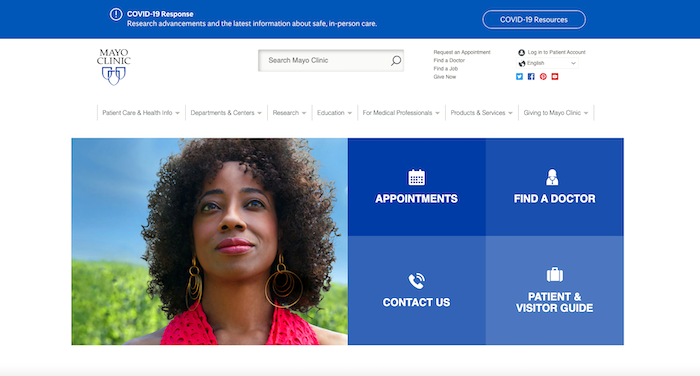
Avoid hidden navigation in favor of organized menus that clearly address patients’ most common needs. The most important pages should be easy to find. Mayo Clinic does a fantastic job of this on their homepage (shown above).
Pro tip: Use Google Analytics to determine which pages of your website receive the most traffic. Then verify that those pages are easily accessible from your home page’s navigation menus. And be sure that your mobile navigation is equally clean and simple.
Design your website for fast load speeds
A website that takes too long to load is one that nobody will stick around to see.
As we’ve emphasized: Did you know that viewers start abandoning your website after mere seconds of load time? Between seconds four and five of your website’s load time, 20% of viewers have already left your site. The percentage only increases from there. Not only that, the faster your website loads, the higher it ranks with search engines and the easier it is to find.
Design with load speeds in mind. Not sure how? Learn more here.
Make your website accessible

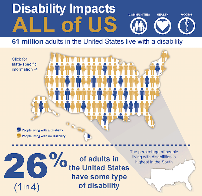
People of all health levels will need to access your website. According to the Centers for Disease Control and Prevention, 61 million adults in the United States have some type of disability. That’s just over one-quarter of Americans.
Add to that number those who are sick and those who are stressed as a result of a family member’s injury or illness, and you can assume many of your website’s visitors will be experiencing an impairment of some kind. It’s essential that your website design allows these users to get what they need.
Accessible web design ensures that all people visiting your website can navigate it successfully. And it shows that your healthcare business knows and cares about its audience.
Keep in mind the following accessibility tips:
- Use higher contrast ratios to improve visibility
- Avoid designs that rely too heavily on color—consider colorblind users
- Use a consistent navigation scheme for ease of use
- Ensure your website can be navigated using a mouse or a keyboard
- Use responsive design to adapt to whatever type of screen your visitor is using
- Use plenty of white space to make your website easy to read
For more detailed guidance on web-accessible design, read this article from UC Berkeley.
Ensure your website is HIPAA compliant
As you know, in the U.S. healthcare system, the Health Insurance Portability and Accountability Act (HIPAA) governs much of what healthcare companies do.
Many of today’s patients are also aware of HIPAA. If your website isn’t HIPAA compliant, you run the risk of appearing wildly unprofessional (at a minimum), paying expensive fines, or even doing jail time (at a maximum).
What does a HIPAA-compliant web design look like? Here are a few guidelines to get you started:
- Your website must protect patient data. All files, data storage, and data transmissions must be SSL encrypted.
- Electronically protected health information (ePHI) should not appear anywhere on your website. This includes testimonials, case studies, and web copy.
- Does your website encourage new patients to fill out a form to schedule an appointment? Make sure the data in that form is protected. Even simple contact info (name, email, and phone number) should be encrypted.
You can learn more about HIPAA website compliance here.
Create a unique website design that inspires trust

As we’ve mentioned, patients trust the healthcare industry with their well-being. But it’s hard to give a business that trust if their website is full of typos or poor design.
There’s no room for error in your copy, your coding, or your design. Failure to pay attention to details like these will drive visitors away.
In addition, if your site uses a template and looks like thousands of other healthcare sites, your patients and prospective patients won’t be able to differentiate you from your many competitors. This also holds true for elements of your brand identity, including your business name and your logo. Be sure both are unique.
As we’ve emphasized in our guide to starting a business, a new business depends on its website as a vital ambassador and a crucial component of its marketing and branding strategy. But this is equally true for an existing business. It’s too easy for people to assume a lack of attention to detail on your website means you’ll be similarly lax with the healthcare or health insurance tasks that are so important to your patients.
When building or updating your website, be sure to:
- Proofread your web copy for grammatical, spelling, and informational errors.
- Get a professional to design your website. Avoid website builders and generic website templates (even if they’re free).
- Test your website for functional errors. Ensure all links and forms are working as they should.
Review your website with the same critical eye you would apply to a patient’s chart or insurance paperwork. No detail is too small. If you don’t find the errors, potential patients will.
Web design trends
Web design never stops evolving. That constant movement leads to evolution, innovation, and occasionally some regrettable web design trends. Still, it’s smart to keep an eye on trends, as they often lay the foundation for new best practices. Here’s a good look at the latest website design trends.
Healthcare has never been more important. And your healthcare business—whether you provide medical support or financial support—plays a vital role in the well-being of patients. Don’t let your important work be held back by poor web design.
Your business needs a strong, professional website to best serve its patients. Follow the tips we’ve shared and you’ll make a stronger impression and win over more patients.
Katie Lundin is a marketing and branding specialist at crowdspring, one of the world’s leading marketplaces for crowdsourced logo design, web design, graphic design, product design, and company naming services.
